Frontier Tower Website
I designed Frontier Tower's site, then rebuilt it in production. It was my first time taking my own design all the way to code, with Claude implementing alongside me. About eight weeks, brand to live.
Visit the live siteTL;DR
- Role
- Senior Product Designer. I led the design and, for the first time, implemented it end to end with Claude.
- Team
- Christian Peters (review, releases, and code fixes) · Claude (implementation pair)
- Timeline
- About 8 weeks, late April to mid-June 2026, brand to live
- Stack
- Figma (wireframes), Next.js 16 App Router, TypeScript strict, Tailwind v4, shadcn/ui (restyled), GSAP (ScrollTrigger + ScrollSmoother), Framer Motion, deployed on Vercel. Implemented with Claude.
- Outcome
- Heuristic score 24 → 36/40 on the same rubric · CLS 0.009 · Lighthouse accessibility 96, SEO 92, performance 63 (TBT and LCP miss my own budget; owned in the closing) · an onboarding flow built but not shipped, shelved by a roadmap change
The problem
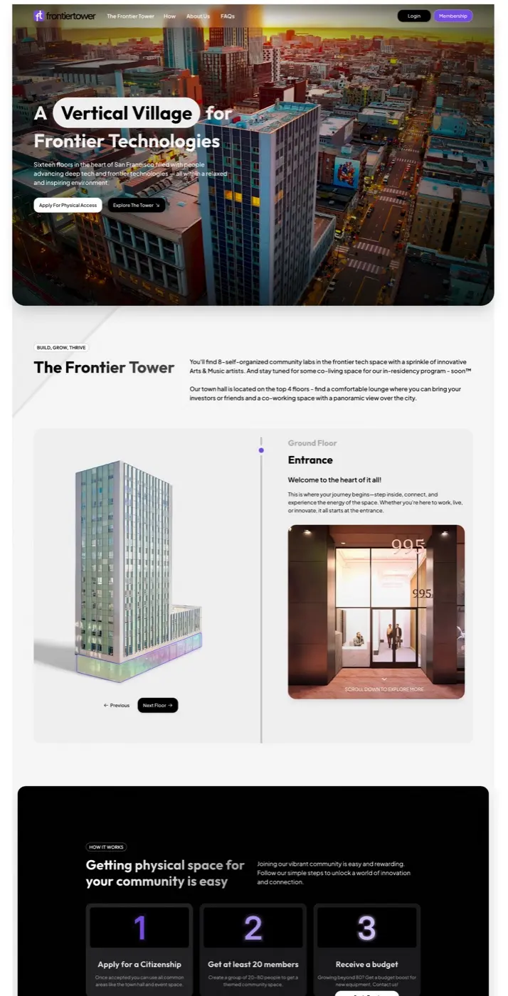
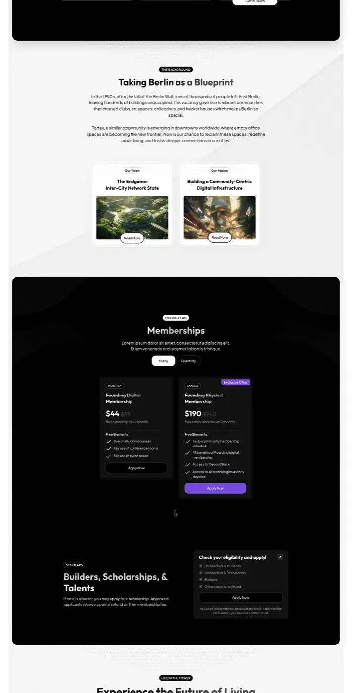
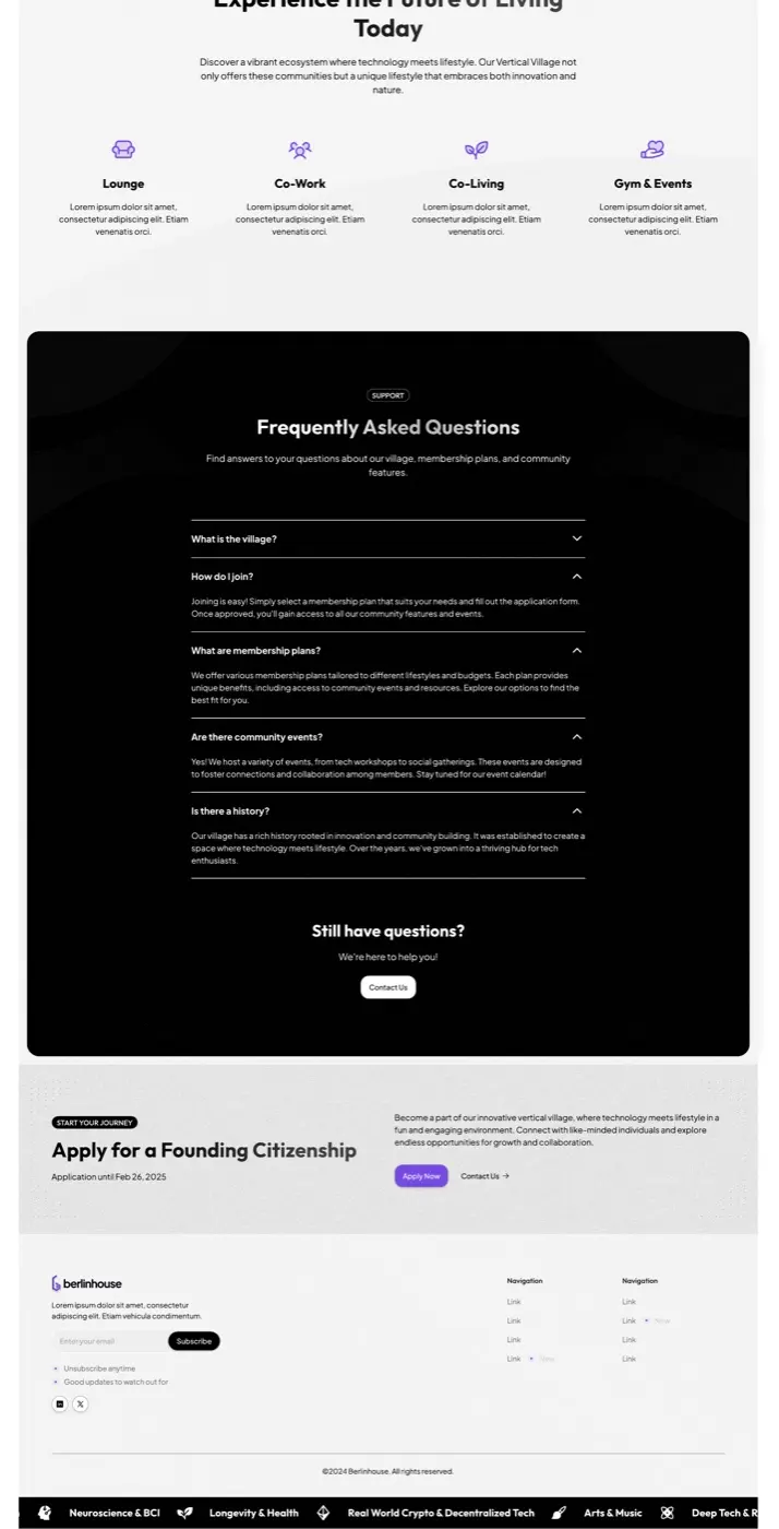
Frontier Tower is a 16-floor vertical village in San Francisco: robotics on one floor, biotech on another, an arts salon above that. Its website was mine too, designed about a year ago in a rush and handed off to build. What shipped drifted: template gradients, generic icon grids, leftover “Taking Berlin as a Blueprint” copy on an SF building's site.
The site it replaced? I designed that one too. That's the story.
Before redesigning, I audited it. Nielsen's 10 heuristics, same rubric my build-time critique tooling uses:
Old site: 24/40 · New site: 36/40. The biggest gains are in real-world match, recognition over recall, and consistency. Expert evaluation, single evaluator: directional, not user data. Full table in the appendix.
The brief I gave myself: make the building legible, and close the gap between what I design and what ships.
My role
I led the design in Figma, and for the first time I carried it into production myself, with Claude writing the code while I made the design calls, tuned values by eye, and cut what wasn't working. The people around it shaped it: ops caught a tour CTA that was misrouting inquiries, and members' reactions retired my most ambitious idea (below). I'd have wanted more founder input than I got, and next time I'd ask for it earlier and more directly. The accessibility work I owned end to end, from the WCAG (Web Content Accessibility Guidelines) audit to the fixes, and I verified everything on real devices, at 360, 390, 768, and 1280px.
About eight weeks from brand to live, late April to mid-June 2026.
Scope
The whole site, not a landing page
Frontier Tower's site is not one page, and all of it is mine. I designed and built every route end to end: the marketing pages, the operational guides the team runs the building on, and the legal pages. The full directory:
- Home
- About
- Apply
- Events
- Residency
- Office
- Start a Community
- Frontier OS
- Event Guide
- Media Guide
- Big-Event SOP
- Privacy
- Terms
The system
A design system built for the landing, on purpose
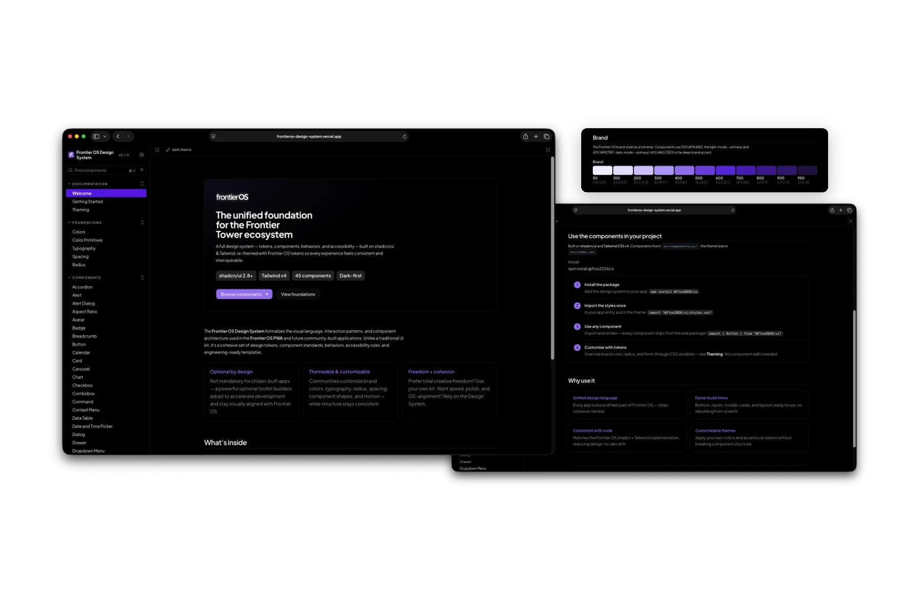
Frontier Tower's app (FrontierOS) has its own design system. The landing page deliberately doesn't use it: a product UI and a marketing site have different jobs, and this one needed a more future-forward personality.
The set piece
The tower finally acts like the tower
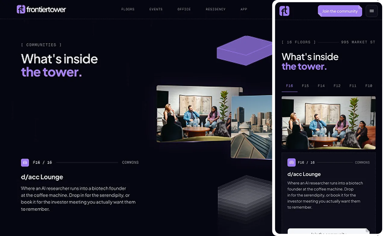
Click a floor: it lifts out of the stack in purple, the rest dim and re-sort, real floor photos float into the gap on tilted cards. On load, a gray-to-purple sweep climbs all 16 floors.
“It gave the tower its whole personality digitally. Finally a design that fits what the building is supposed to feel like.”
It started as a 1900vh scroll-hijacked experience. Members said the long scroll got in the way of exploring, and on some devices the screen shook. On the morning of June 5 I shipped a scrub fix; by the afternoon I retired the pattern entirely. One viewport, click-driven floors, the choreography intact. Weeks of scroll work set aside in an afternoon, which was only possible because I could feel the problem and make the change from the same seat.
Mobile got its own design, not a squeezed tower: scroll-snap floor browser, crossfading photos, 44px targets, no pinning.
Pointed inward
Onboarding: the same thinking, pointed inward
Built last, then shelved before release: a roadmap change put it on hold before it was reviewed. A guided flow for new citizens, driven by support reality, members don't read text-heavy setup docs, and access questions flooded the channel.
Eight visual beats, “about 3 minutes” promised up front. The WiFi beat replays the entire UniFi enrollment as frame-accurate animations in an iPhone frame. The tour beat forks, 360° tour or book a walkthrough, and 14 Matterport floor scans load only on click, so no third-party requests fire unasked.
Growth
Growth work without a data team
- A/B tested the homepage (pricing above the fold, three sections cut). Sample too small for significance; treated it as directional, shipped the variant. The judgment call is documented in the code.
- Fixed lead routing by deleting a CTA. “Book the Friday tour” advertised a tour that didn't exist and attracted the wrong inquiries. Killed it, restored a secondary “Talk to the team” 27 minutes later: apply for commitment, talk for questions.
- SEO housekeeping: schema.org markup, a link-preview bug fixed across eight pages, verified in live scrapers.
What I killed
- The 1900vh scroll tower. The strongest version needed its central mechanic removed.
- An investor data-room gate. Three iterations in one afternoon, then I closed my own PR (pull request). The page read better without another gate.
- A scatter-text effect. The A/B said the leaner page was the better default.
Where it stands
Live in production. One honest scope note: the version in this case study is the one I designed and deployed at first launch. Since then the live site has been maintained and changed by the tower's tech team, not me, and I made no changes after that hand-off, so frontiertower.io today may differ from what I shipped and what I show here.
No analytics access anymore, so no traffic claims. What I could measure on the version I shipped, I did:
Heuristic (was 24)
36/40
CLS · budget 0.05
0.009
Lighthouse a11y / SEO
96 / 92
Lighthouse perf
63
TBT (Total Blocking Time) 410ms is the motion tax, and the first number I'd attack next.
What didn't go well
- The site misses its own performance budget. I set TBT < 200ms; it ships at 410ms, and LCP (Largest Contentful Paint) came in at 2.7s against a 2.5s budget in the same lab run. The motion system I'm proudest of is what costs it. CLS 0.009 says the discipline worked elsewhere; these numbers say where it didn't.
- I built the scroll tower for six weeks before real users touched it. They experienced it as an obstacle. The fast kill gets told as a win; the slow feedback loop that made the kill necessary was the actual failure.
- Speed left debt. Dead scroll-era constants, stale comments describing abandoned architectures, a hook with zero call sites. Build velocity produces cleanup work at the same velocity, and solo means nobody forces it.
- My own killed pattern came back. A month after removing scroll-pinning from the homepage, I caught myself reintroducing it on a new microsite, my own critique tooling flagged it as a P0 (priority zero, the top-severity rank). Taste relapses. That's what the audit loop is for.
In hindsight
What this project taught me
As a product designer, I'd always drawn the thing and handed it to engineers to build. This was the first time I implemented one myself, end to end, with Claude doing the heavy lifting in code while I held the design and the details. It changed what I can carry from an idea to something live, and it made me a better teammate to engineers, because now I feel the cost of what I draw.
Working this closely has a real caveat: when the person who designs and ships steps away, in-flight work can stall. The docs and constraints I left behind are the mitigation, but the tension is honest. And I'd push for founder feedback earlier next time. I asked, the responses were thin, and more calls fell to me alone than I'd have liked, with members' comments as the check.
Christian reviewed the work, gated the releases, and helped with code fixes, and we refined the copy together. The design system, the accessibility work, and the build were mine, made possible by pairing with Claude.
Other design artifacts
Heuristic evaluation, old vs new
Nielsen's 10 heuristics · scored 1–4 each · old site from the archived capture · new site live, July 2026 · single evaluator, directional, not user data
1 · Visibility of system status
23
Old: no active-section cues anywhere. New: active floor states with aria-current, section-jump flash chip, carousel progress dashes. Long page still lacks a scroll progress cue.
2 · Match with the real world
24
Old: leftover “Taking Berlin as a Blueprint” section on an SF building's site; unexplained “Founding Citizenship” jargon. New: 16 real floors with photos and names, live events feed, SF-anchored copy.
3 · User control and freedom
34
Old: plain scroll, fine. New: scroll-hijack deliberately removed after user feedback; click-driven tower; reduced-motion respected; third-party iframes load only on click.
4 · Consistency and standards
24
Old: mixed template styles (gradient step numbers next to flat cards). New: token-enforced consistency, one radius rule, unified “Apply now” CTAs, one button system, global type scale.
5 · Error prevention
34
Old: little to get wrong. New: field-level server validation surfaced inline, bot traps that don't punish humans, payment retry reuses the PaymentIntent so a declined card can't create duplicate applications.
6 · Recognition over recall
24
Old: the building's contents were invisible, generic amenity icons (Lounge, Co-Work, Gym). New: every floor shown with real photos, memberships enumerated with prices, events listed from the live feed.
7 · Flexibility and efficiency
23
Old: single linear path. New: number-key section jumper for keyboard users, anchor nav. No site search.
8 · Aesthetic and minimalist design
23
Old: template DNA, decorative gradients, icon grids. New: systematic but ornament-rich (grain, brackets, register marks); the A/B variant cut three below-fold sections, minimalism enforced by evidence.
9 · Error recognition and recovery
33
Old: mostly n/a. New: inline form errors with a fallback email line; designed 404. Parity in practice.
10 · Help and documentation
34
Old: one generic FAQ. New: FAQ plus event guide, media guide, big-event SOP (standard operating procedure), per-floor descriptions.
Total
24/4036/40
Biggest gains where a marketing site earns trust: real-world match +2, recognition over recall +2, consistency +2.
The remaining gap to 40 is honest: no scroll progress cue, no search, and the ornament density is a brand choice a strict evaluator would dock.
Next project
2026 · Web