Compensatory Time Off in Mobile
Bringing Sprout HR's overtime-conversion tool to mobile and growing the app's monthly active users by 25.83% in three months.
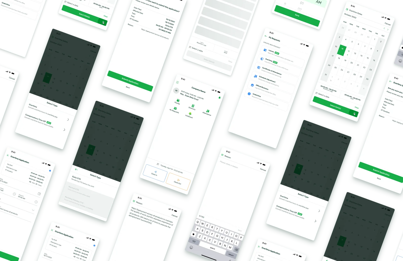
TL;DR
- Role
- UX Product Designer, sole designer on the feature after the first two weeks
- Team
- Product Manager, IxD (interaction design) designer (handover period), HR front-end and back-end engineers
- Timeline
- Aug–Dec 2022 design · shipped Nov 2023
- Outcome
- +25.83% monthly active users (+12,384) within three months of launch, plus a reusable “What's New” onboarding pattern the mobile team still ships new features with
The problem
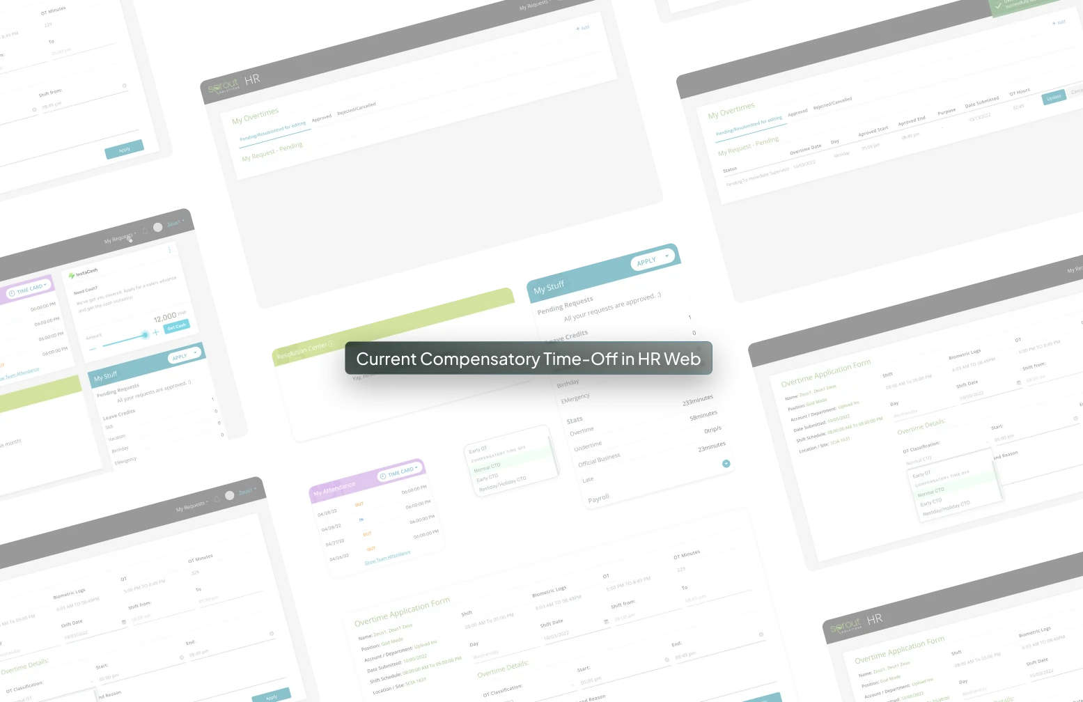
Compensatory Time Off (CTO) lets employees convert overtime into leave instead of pay. It was one of the most-used features in Sprout's HR web app, and one of the worst-rated: the web version scored 37 on the System Usability Scale. Anything under 51 is a usability failure. A 37 meant employees were leaning on HR admins to complete a task the product should have handled.
The business goal was to bring CTO into the mobile app and grow mobile MAU (monthly active users) by 25%. My design goal was stricter: don't port the web version's problems to a new platform.
Baseline: 48,000 mobile MAU, 76% on Android.
Three months after the November 2023 release: +25.83%, or 12,384 new monthly active users.
My role
I joined Sprout's mobile team as a UX Product Designer and was handed this project in my second week. Michael Raquel, an IxD designer, supported the ramp-up; from week three I owned it end to end: research, ideation workshops, usability testing, iteration, and stakeholder presentations, working directly with our PM and both HR engineering teams.
Four months from kickoff to hand-off, August to December 2022.
Define & ideate
Measure before you migrate
Instead of starting from the mobile UI, I started from evidence: an SUS (System Usability Scale) survey on the existing web CTO experience, so the mobile version could be scored against a baseline rather than opinions.
13,688 users answered, 17.3% of monthly web users. The score came back at 37, and the open feedback told me exactly where the damage was:
“it is hard to use to be honest. I would be easier if there are lesser options.”
“I'm not sure if im choosing the right CTO type”
“the screen where you put the time isn't clear, too many fields…”
“Dropdowns and forms not user friendly”
“ux can be further improved. Layout looks dated”
“This site is literally the slowest site I've encountered. […] I always end up wasting 10-15 [minutes]”
What users were actually asking for: fewer options, clearer types, faster recovery
Three patterns drove everything that followed:
- Type confusion. Users couldn't tell which CTO type applied to them, and the product offered no way back from a wrong choice, so they escalated to HR admins.
- Too many fields, too many steps. CTO filing is a routine task; the form treated it like an exception.
- No error recovery. Mistakes surfaced late or not at all.
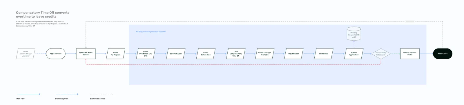
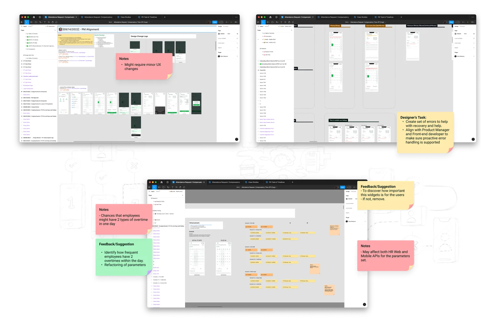
I brought these to a series of working sessions with our PM, my co-designer, and the HR front-end and back-end teams. The technical unlock we landed on: derive the form from biometric logs. Present only the options the user's actual attendance data supports, and flag mismatches proactively instead of rejecting submissions after the fact.
That unlock had a price we chose to pay. The fast path was porting the web's manual CTO logging to mobile as it was. We gave that up and spent the schedule redesigning the logic underneath: CTO is now calculated automatically from the employee's shift and their company's HR rules, nothing typed in by hand. Our PM pushed back on the slower road at first; the usability-testing results are what made the case.
Testing the solutions
Validating the design
I ran a moderated usability test with 10 frequent CTO users (client employees, not ours), remote, over one week. The design held up overall; two findings were critical enough to stop and fix:
- The “Restday–Holiday CTO” name confused almost everyone. “The confusing part only is the type ‘Restday–Holiday CTO.’”
- Users didn't trust the new flow existed. Several filed overtime first out of web-era habit: “I applied it as OT (overtime) so that the number of hours can be converted to CTO.”
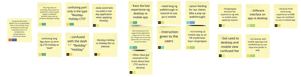
Post-testing iterations: critical point #1
A punctuation mark, tested
A dash reads as and; a slash reads as or. For a leave type that applies on a rest day or a holiday, that single character changed whether users picked correctly.
“Instead of a dash, put a slash / for Restday/Holiday CTO”
“So yung holiday falls on the restday. Yung employee pumasok siya nung day na yun, it is considered as compensatory or converted to leave.”
Engineering pushed back on changing the label. Rather than decide by taste, I surveyed internal employees on both namings. The result was decisive: “Restday/Holiday CTO” matched users' mental model; the dash version didn't. The evidence settled it, and we shipped the slash.
- Most respondents read it as “Restday / Holiday CTO” (with a slash), which matches the intended usage for this CTO type.
- A smaller group read it as “Restday-Holiday CTO” (with a dash): the same meaning, just fewer people.
Post-testing iterations: critical point #2
Onboarding built to be reused
The second finding was about familiarity, and the numbers made the case for me:
- 10/10 test users asked for a walkthrough on mobile
- 8/10 were more comfortable on web
- 4/10 tried to file overtime first, replicating the web workaround
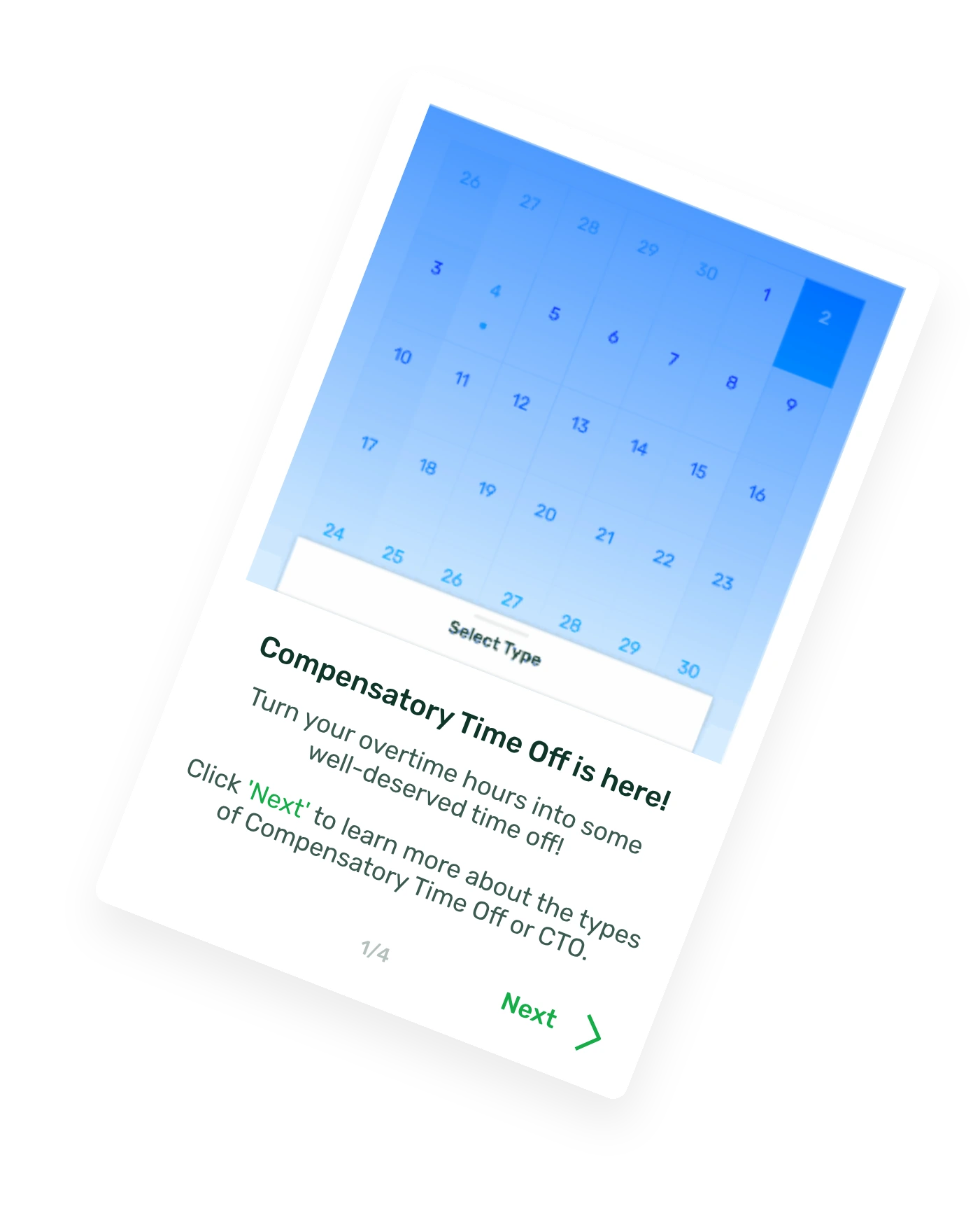
Working with engineering on what was feasible, I designed a “What's New” onboarding modal, deliberately spec'd as a pattern rather than a one-off, so any future mobile feature could launch with it. The mobile team has used it for feature launches since.
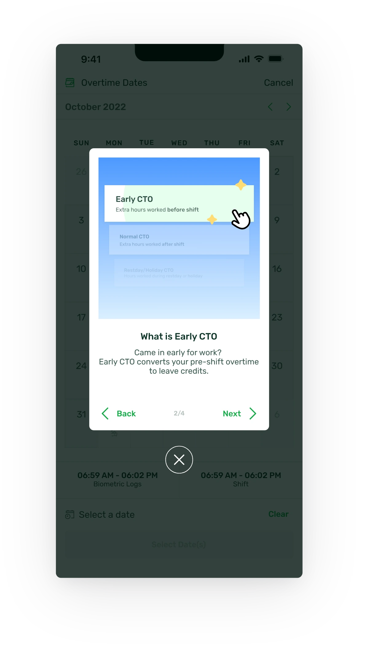
Final design solution
What shipped
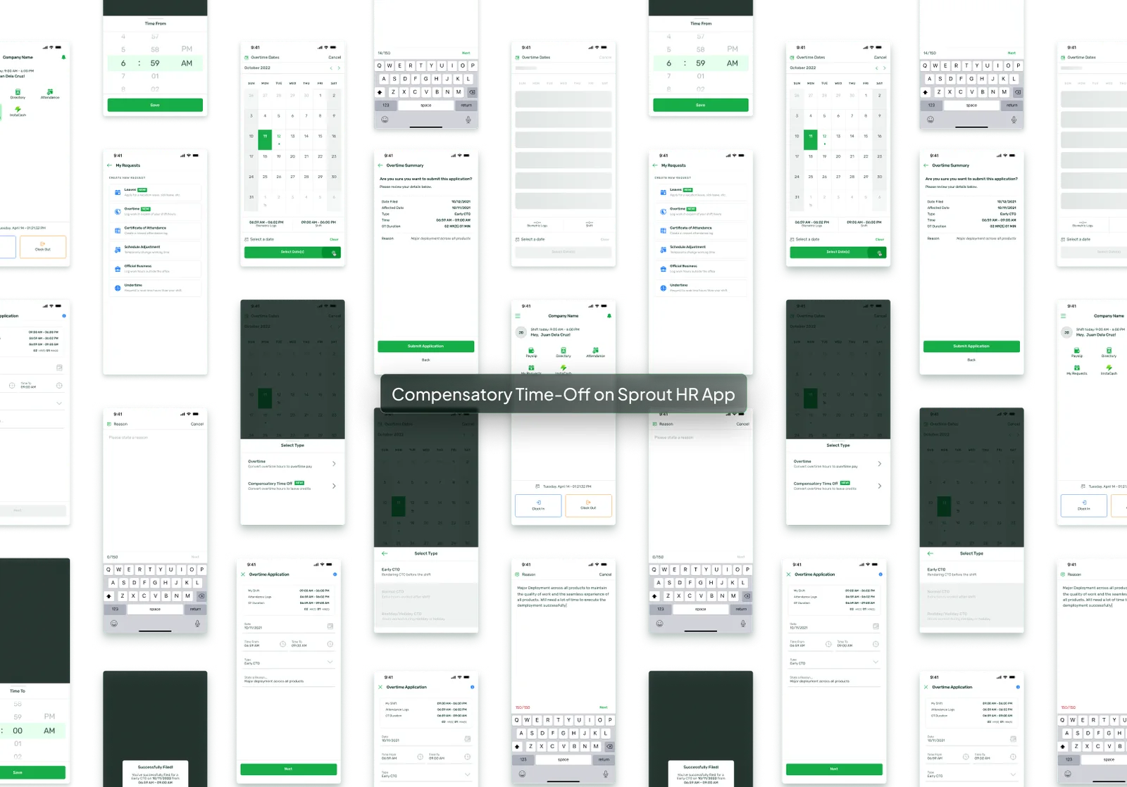
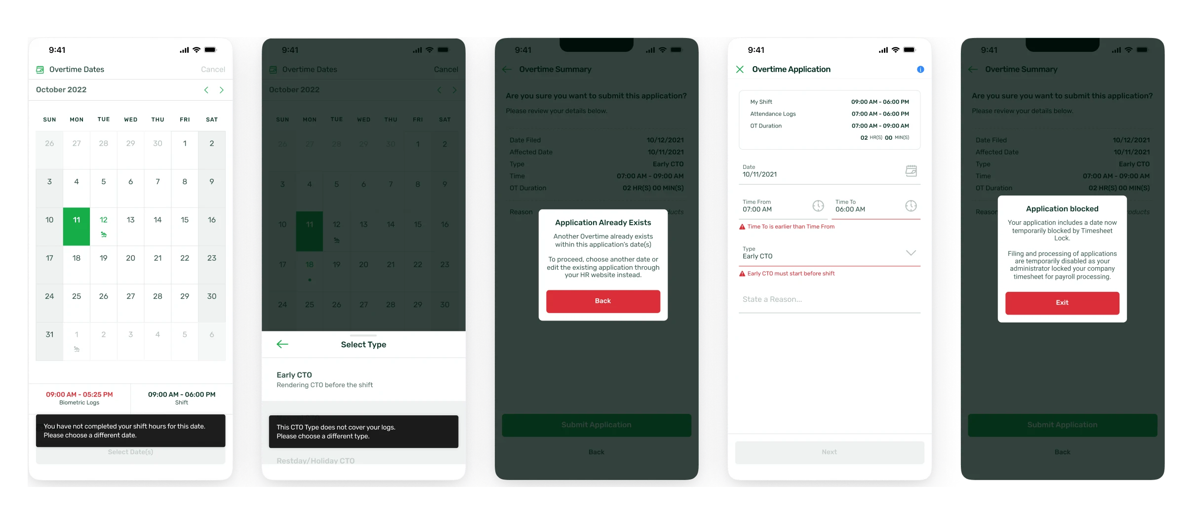
The final design cut the filing flow down to what the user's own attendance data supports: fewer fields, pre-validated options, and recovery built in at the moment of error rather than after submission.
Other notable experiences
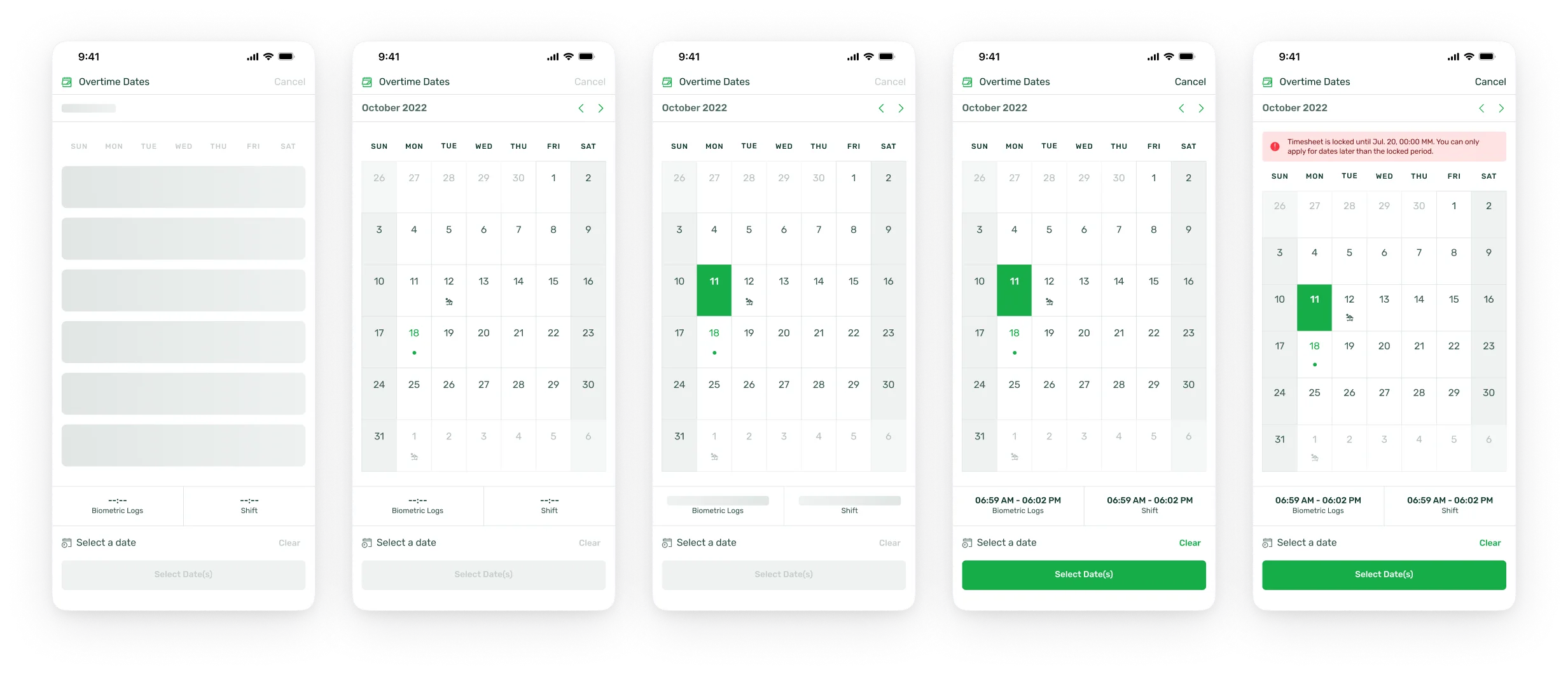
Date selection that knows your calendar
The picker surfaces national and company holidays, upcoming leaves, and active working days, so choosing a valid date for overtime conversion takes one glance instead of a back-and-forth with HR.
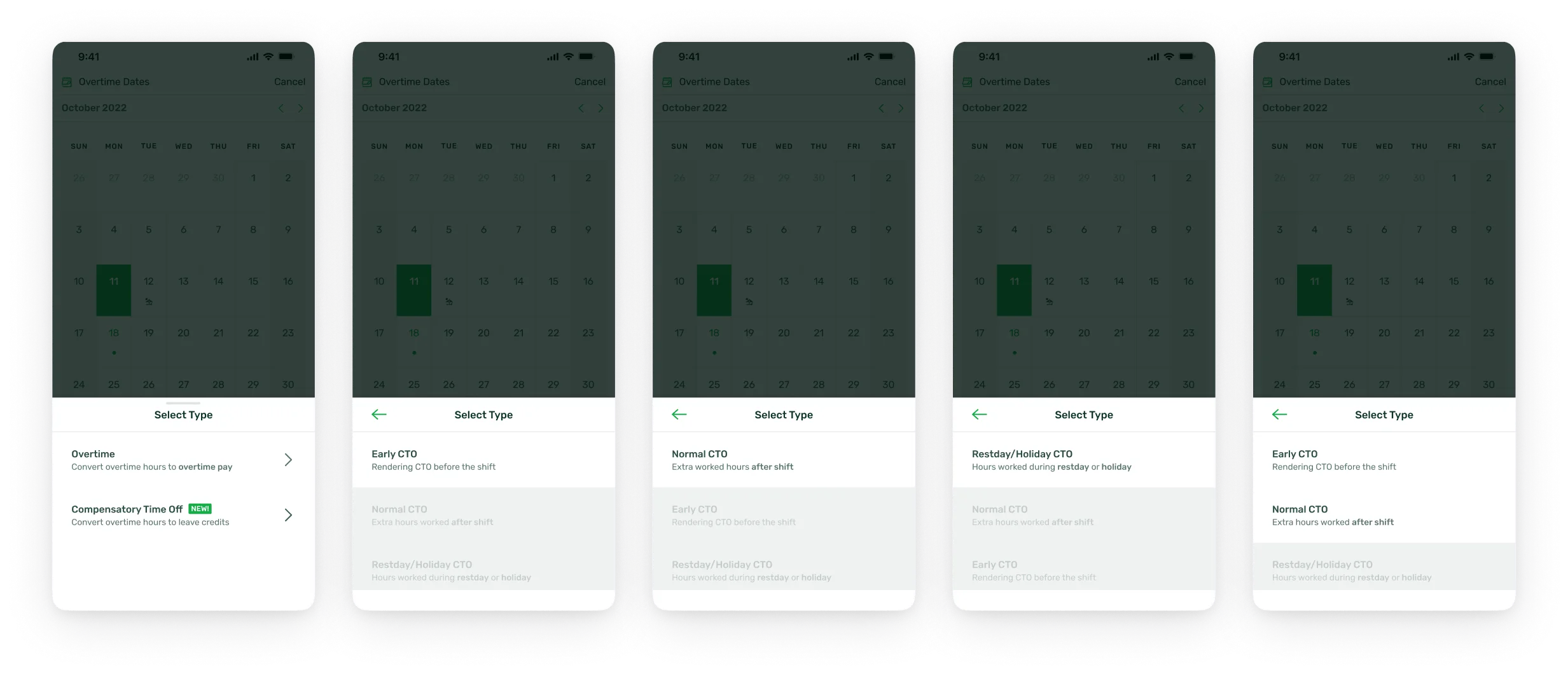
A type selector that does the math
CTO types are offered based on accumulated hours, with the calculation shown. The wrong choice (the #1 pain on web) is no longer available to make.
Errors caught at the source
If a request doesn't align with biometric logs or logged hours, the app flags it inline, immediately, with a path to fix it. No guessing, no rejected submissions a day later.
Where it stands
Deployed to clients since February 2024. Post-launch metrics moved to a separate team's ownership after my involvement ended; the last figures I can stand behind are the +25.83% MAU three months in. The Client Success team continues collecting feedback for the mobile team's iteration backlog.
In hindsight
What this project taught me
I got this brief in my second week, before I knew the product or the team. What made it work wasn't ramping up faster. It was refusing to design without a baseline, and keeping engineering in the room from the first synthesis onward. Fail fast, fail forward: the naming survey cost two days and saved a support-ticket problem we'd have owned for years.
Next project
2026 · Web